Graph Type
-
Wind Vector & Temperature Contour Plot
-
Vertical Temperature Contour Plot
-
Wind Contour Plot (Vector, Velocity)
-
Time Series Plot of Temperature at Specific Altitude by Scenario
1. Wind Vector & Temperature Contour Plot
Graph Type: Vector & Countour Plot
Time: 08-01-15:00:00 ~ 08-02-15:00:00 (each 1hours)
X axis: Region Size (100 grid)
Y axis: eta value
Color Bar: Temperature(℃)
Graph Description
-
Temperature is represented by color, with blue indicating lower temperatures and red indicating higher temperatures. The color gradient reveals the "dome" shape of elevated temperatures created by the urban heat island effect.
-
The wind vectors indicate the direction and speed of wind about the heat island effect. The direction is shown by the orientation of the arrows, and the speed is represented by the length of the arrows. This visual representation helps us understand how the movement of air is restricted when the urban heat island effect is present.
Objective
-
This plot visualizes the distribution of temperature and wind to illustrate the formation of the urban heat island effect. Vertical air convection can be observed.


2. Vertical Temperature Contour Plot
Graph Type: Contour Plot
Time: 08-01-15:00:00 ~ 08-02-15:00:00 (each 1hours)
X axis: Region Size (100 grid)
Y axis: Altitude
Color Bar: Temperature(℃)
Graph Description
-
Temperature is represented by color, with blue indicating lower temperatures and red indicating higher temperatures. The color gradient reveals the "dome" shape of elevated temperatures created by the urban heat island effect.
Objective
-
This plot visually represents the formation of the urban heat island effect through the vertical temperature distribution. Unlike the previous graph, the vertical height is limited to 1000 meters to better capture temperature changes caused by the urban heat island effect.
-
This graph allows us to focus on and intuitively observe the urban heat island effect in detail.
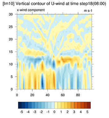
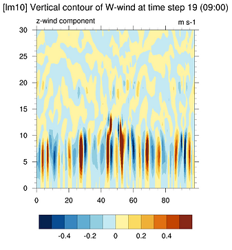
3. Wind Contour Plot
(Vectors, Velocity)
Graph Type: Contour Plot
Time: 08-01-15:00:00 ~ 08-02-15:00:00 (each 1hours)
X axis: Region Size (100 grid)
Y axis: Wind Velocity (m/s²)
Color Bar: Wind Vector (+/-)
Graph Description
-
Contour of the X-direction & Z-direction wind speed averaged in the north-south direction
-
Graphs based on the length meter (lm) value of the city length variable (lm: 10, 25, 40)
Objective
-
To analyze of the horizontal flow between the urban boundary and the center, specifically the convergence and divergence patterns
-
To identify the patterns of upward or downward flows caused by the urban heat island effect.
![[500m] lm10.png](https://static.wixstatic.com/media/3a20c4_bbe542788b7b4436bebb9c1c7b3abcf7~mv2.png/v1/fill/w_600,h_274,al_c,q_85,enc_avif,quality_auto/3a20c4_bbe542788b7b4436bebb9c1c7b3abcf7~mv2.png)


4. Time Series of Temperature at Specific Altitude by Scenario
Graph Type: xyplot
Time: 08-01-15:00:00 ~ 08-02-15:00:00 (each 1hours)
X axis: Timestep (24hours)
Y axis: Average Temperature
-
Average temperature data with dimensions (time, bottom_top) by averaging temperature data according to latitude.
Graph Description
-
Time series graph of temperature data over time
-
Select a specific elevation of 500 m and the surface to represent the average temperature data for that elevation
-
Scenario-specific representation in one graph
-
Graphs based on the length meter (lm) value of the city length variable (lm: 10, 25, 40)
Objective
-
To examine the trend of average regional temperature changes across different time steps.
-
To compare the trends of average temperature at different altitudes, as studies have shown that the impact of the urban heat island effect extends not only to the UCL but also up to 500m in the UBL layer during the night.

